Pen Plotter & Watercolor Dailies - Week Two
Introduction
It is Sunday again, and this week I want to restart my practice of pen plotter and watercolor dailies. I took a week off from doing these in any formalized way, and felt worse for it. There is something quite nice and grounding about having a daily creative practice, and the commitment that is involved in this. Focusing and iterating on one theme is also a nice way to refine my sense of my own creative “taste”: do I like this more or less than my last attempt? How might I build on the directions of exploration that I do find appealing?
So this week, I will return to my daily pen plotter and watercolor practice. I am still allowing myself to experiment with different variations of this process. Some directions I am interested in:
- More layering and depth. Trading between plotting and painting in the process.
- More contrast and variation in color. Can i be more bold in my application of pigment?
- Different drawing tools. I have a few ideas to experiment with here.
- New algorithmic designs. I am not too inspired by the simple grid of squares I have been working with so far. I have a few other directions in mind.
A few longer term directions I am interested in as well:
- How might I develop this process into something that I can do without needing to be on my laptop. I am inspired by the idea of single-purpose devices, and the analogy of “DAW-less” setups in music production. This would build also on our interactive plotting exhibit at OpenSauce.
- Combination with MCMC drawing process. Putting ink and colors in roughly the right place; using the water to allow them to bleed, but retain something representational in the end.
Anyway, now on to the dailies.
Day 1 (Sunday)
Today I wound up doing a whole mix of experiments.
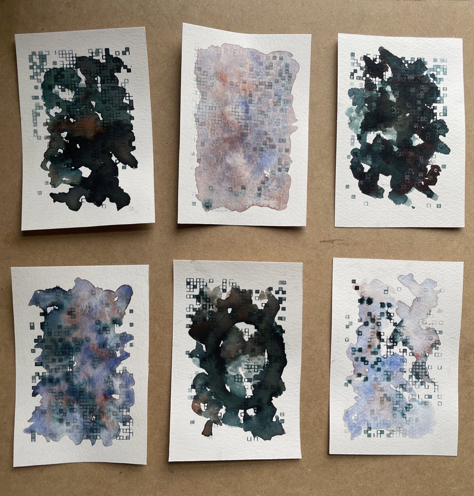
Some new elements:
- More layering and contrast. I tried separating out different layers of the machine drawing, and adding bits of watercolor in between.
- I tried taking the ink out of the pen in several of these, just filling the cartridge with water, and using the ink and pigment on the page to create marks.
- I tried using the fountain pen ink directly for painting in some of these, sometimes mixed with bits of watercolor.
- In one of these, I did another layer on top using a white pencil.
Lots of interesting developments here. Generally I like how the process goes with little ink in the pen, and I like more layering and interaction. For now, I am converging for now on a palette involving the black ink with blue/green undertones, as well as blue and some orange.
Some closer photos of variants I like:
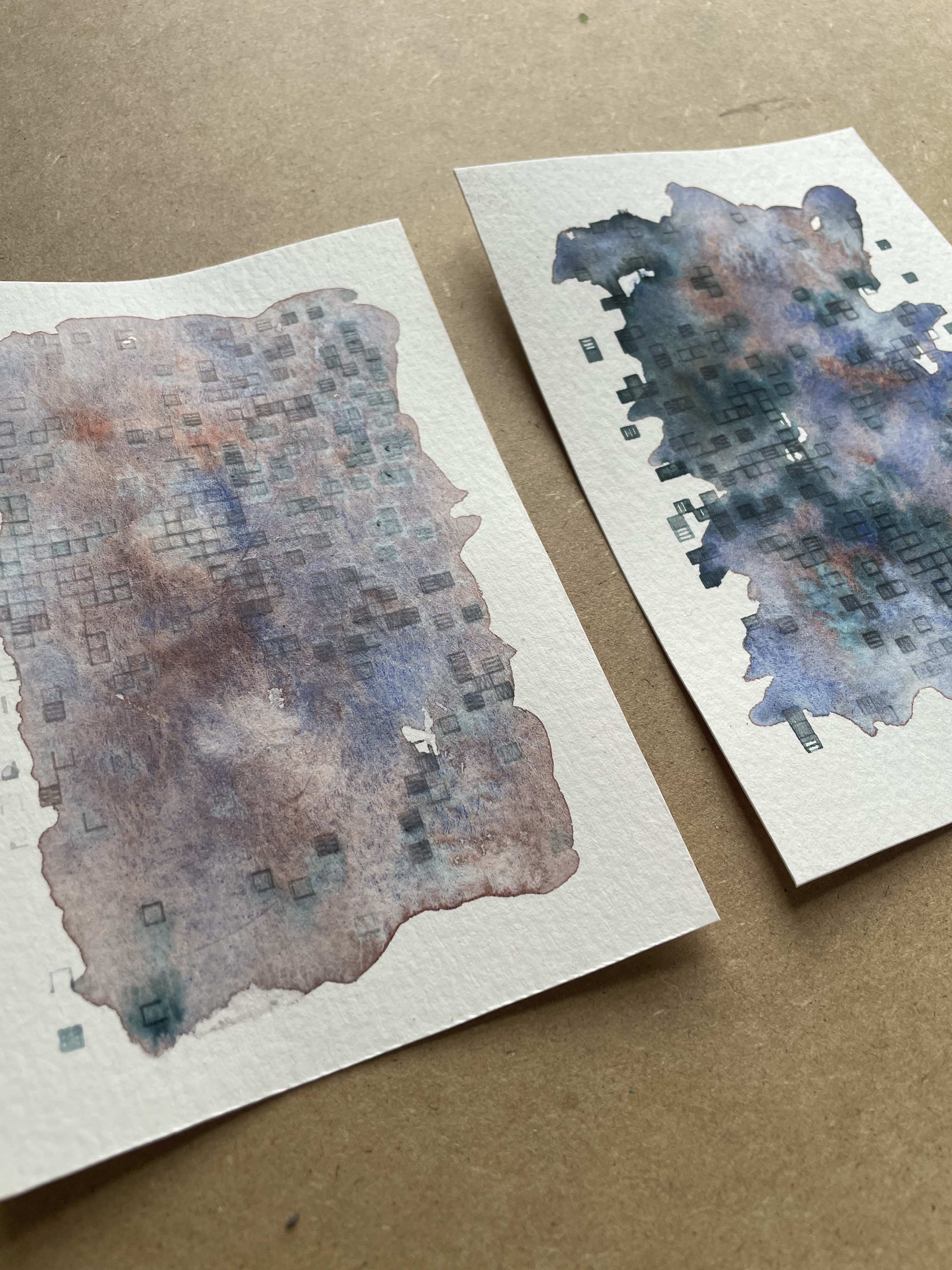
On the left above here is ~no ink into pure watercolor. This next one is layering with ink and white pencil on top (no ink in the pen):
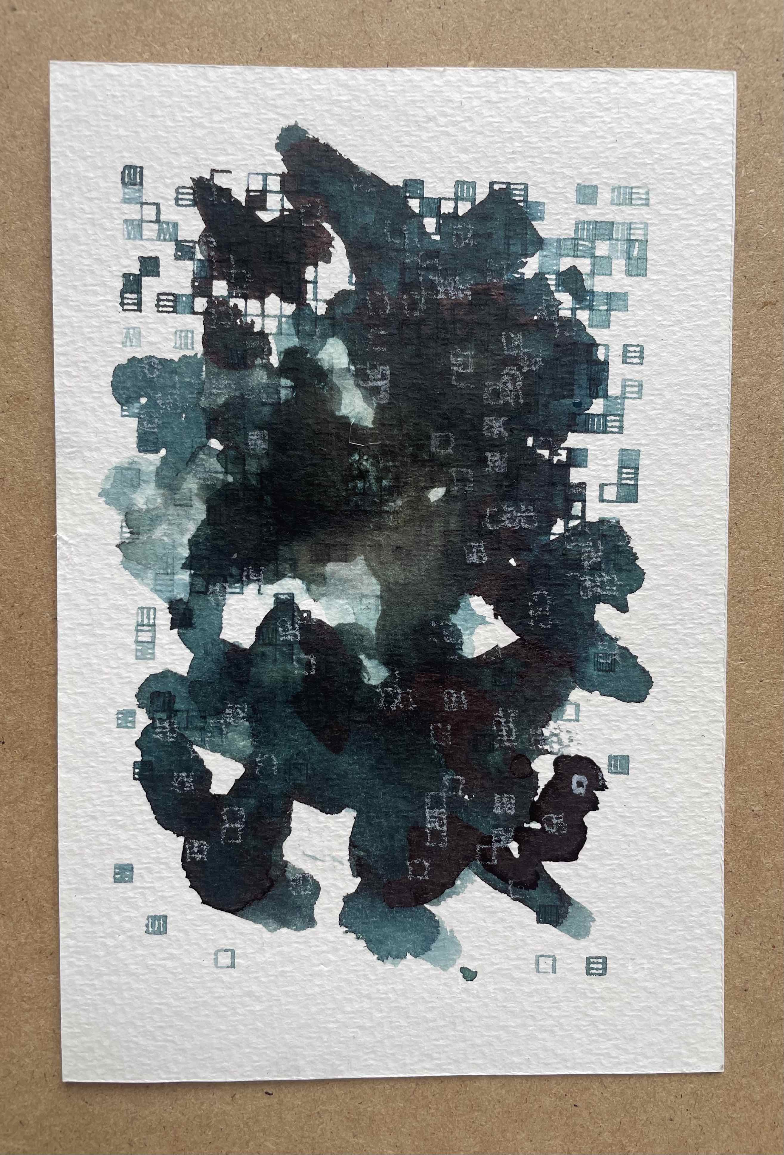
Something that this process has me thinking a lot about is contrast and “depth”. A lot of generative art and pen plotted work (including most of my own) is quite “flat”, visually-speaking. There’s nothing wrong with a visual work being flat; however, I am interested in exploring alternatives. In the pen plotting world, I do see a fair amount of “layering” of colors on the page – e.g. CMYK work; however, it often seems to be about creating particular hues through mixing, rather than trying to create depth and contrast in the work. In this process, I am intersted in exploring the use of layering more to create contrast and depth. The final drawing above is the most successful experiment in this direction so far, but I think there’s a lot more to explore here.
Separately, tomorrow I think I will try creating a clean edge on the pieces, and tidy things up a bit. Stuff like that can sometimes make a surprisingly big difference in the overall feel.
Day 2 (Monday)
Today I am making a few small tweaks on the algorithmic side, pushing for a slightly denser look, and splitting out the design into three separate layers for plotting. Here is the result:
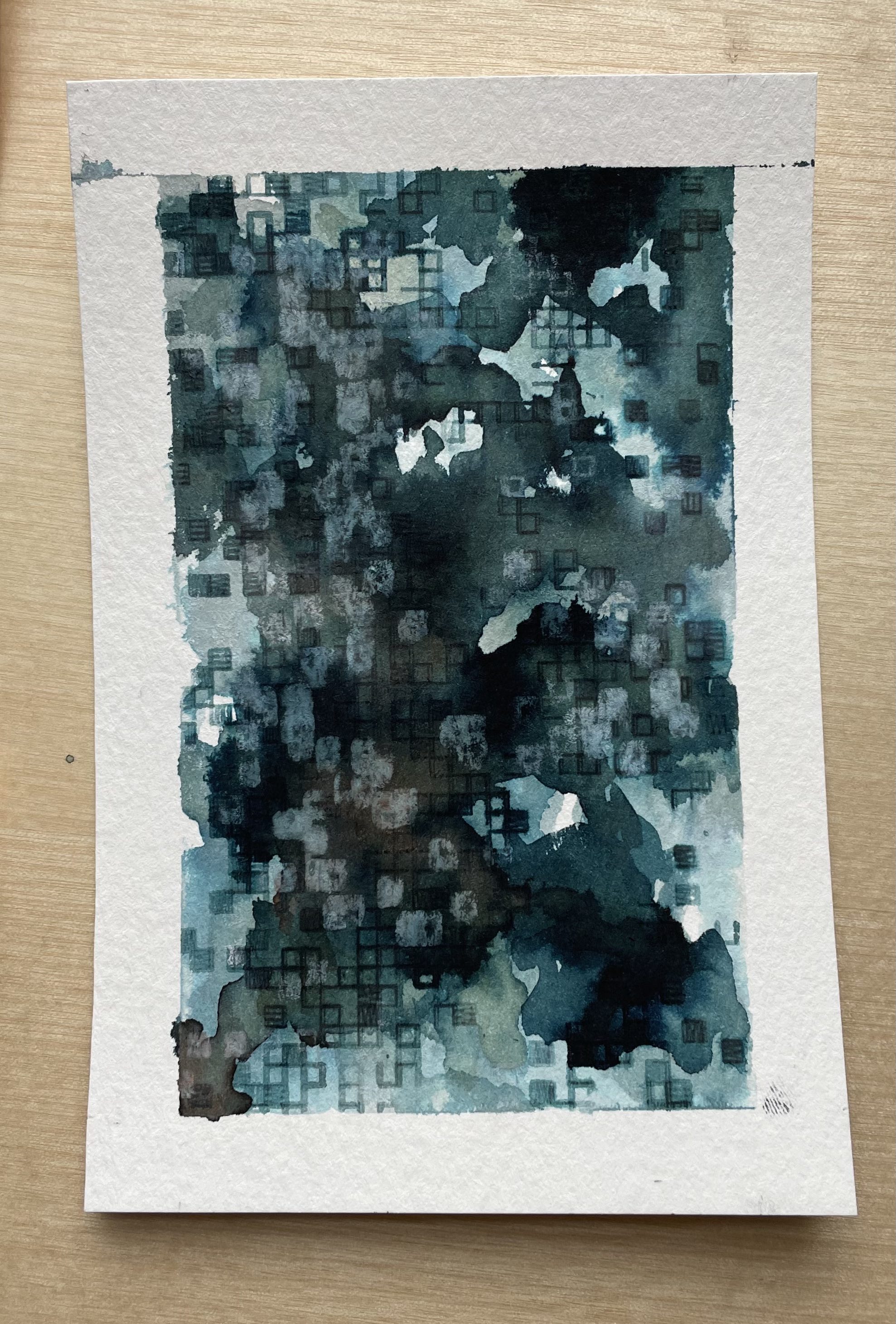
Here, I started with an initial layer mixing ink and watercolor and plotted into that with the inkless fountain pen. Then I added another layer of ink and watercolor and plotted again with the pen. After letting this dry, I did a final plotted layer with white pencil.
At first, I felt that this sketch was a bit busy, but it’s grown on me a bit as I look at it more. In general, I like the texture of the pencil layer on top of the ink and want to experiment with more of that, maybe in different ways. I may also be close to ready to try a bigger sketch tomorrow, or at least some variants to the algorithm that could introduce more variation in scale and perhaps shape.
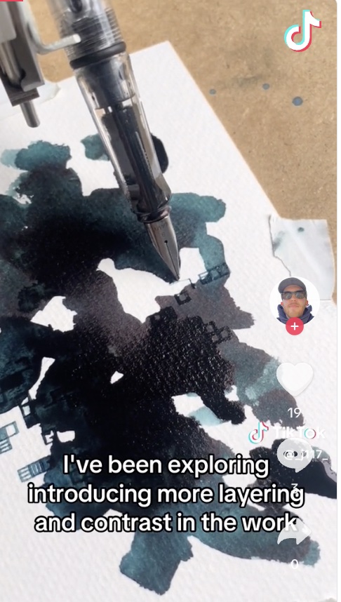
I also made a Tik Tok video today reflecting some more on my recent iterations on this process and thinking about “depth” and contrast in pen-plotted work. Check it out here:
Something that I am thinking about today is how this process of doing daily creative work implicitly encourages me to reflect and be more mindful of the work I am doing, which is good. After each iteration, it’s natural to think about what I like or don’t like about it, and what I could try differently next time. This is a benefit in addition to the feeling of groundedness and commitment that comes with regular practice.
Day 3 (Tuesday)
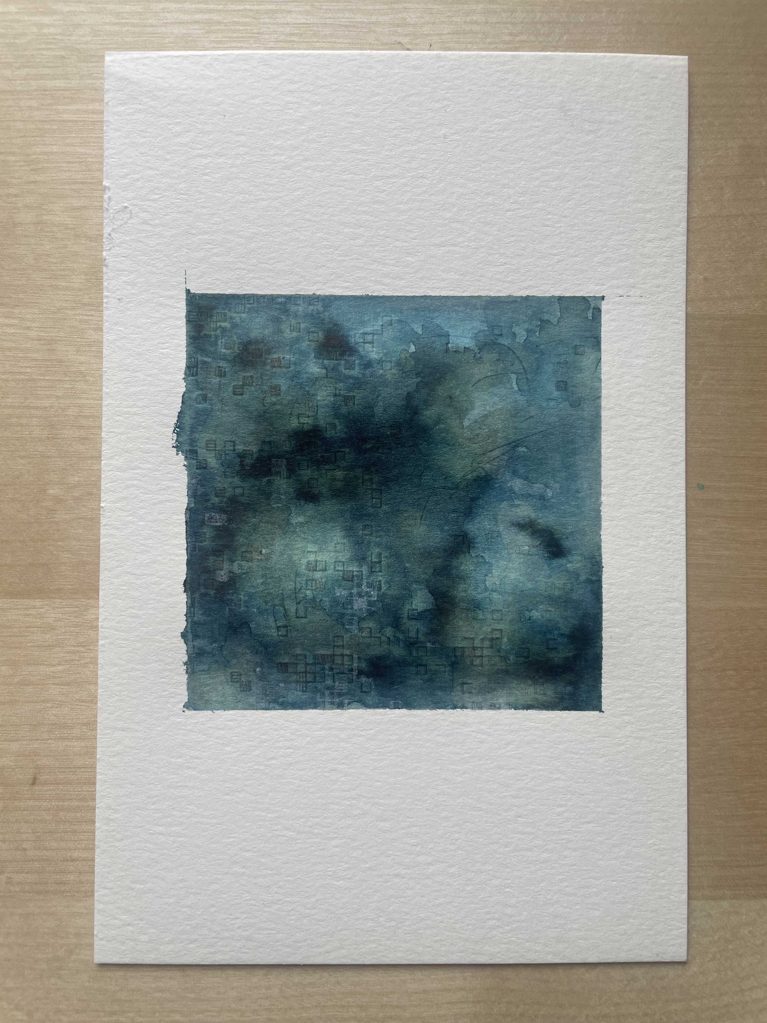
In today’s experiment, I used some new watercolor paper that I picked up yesterday, and consequently changed the aspect ratio of the piece. I did a first layer of diluted ink with, but left it somewhat less damp than some prior tests. I also filled the fountain pen more completely with water. In the first plotter layer this had some interesting effects, as it actually lightened some areas it passed over. I then did a layer with the white pencil. After that, I thought the piece might be done, but was conflicted. I also wanted the depth that comes with more layering, and was concerned that maybe it was just fear of ruining something nice that was holding me back from going in again. I decided to be brave and go ahead with it, and added some more ink and did another layer with the plotter. It came out okay. I am not sure I like doing anything on top of the white pencil, it seems to just mush it around without much interest. I think in the future I will leave pencil layers for the end mainly. In general, I think that more layering is still the way as far as continuing to develop this process. In addition to the results, I enjoy the process of the layering, trading back and forth between me and the machine; active and reactive – co-charting the course. Here is the result:
She said the days were getting shorter
In the end, I think that I like this one quite a bit. I finally figured out a nice setup to get a fairly clean edge and also have good alignment with the plotter. I do think more layering will be nice. But I like not going over the top in terms of the contrast, and blending out the edges of the inked portions more.
Today I am also thinking about how basically all satisfaction in work/creation comes from care and attention. There are no shortcuts. Creative work will be satisfying and meaningful in direct proportion with the amount of care and attention I put into it.
Day 4 (Wednesday)
Today feels like a day that’s already a bit caught up in other things. I think that today I will try doing a bit of an underpainting in my watercolor piece of the puzzle. Feeling today the beauty and self-acceptance implicit in doing things that are “useless” to the world. Even (especially) when there are so many “useful” things to do.
I was talking yesterday with Elspeth about this series of work, and she was saying how it’s a very process-oriented series. I am thinking today about what that means. One the one hand there’s a conceptual dimension to it that I’ve explored in some of the previous writing and videos I’ve made as I work on this. There are conceptually interesting things about working in this way, whatever the visual results.
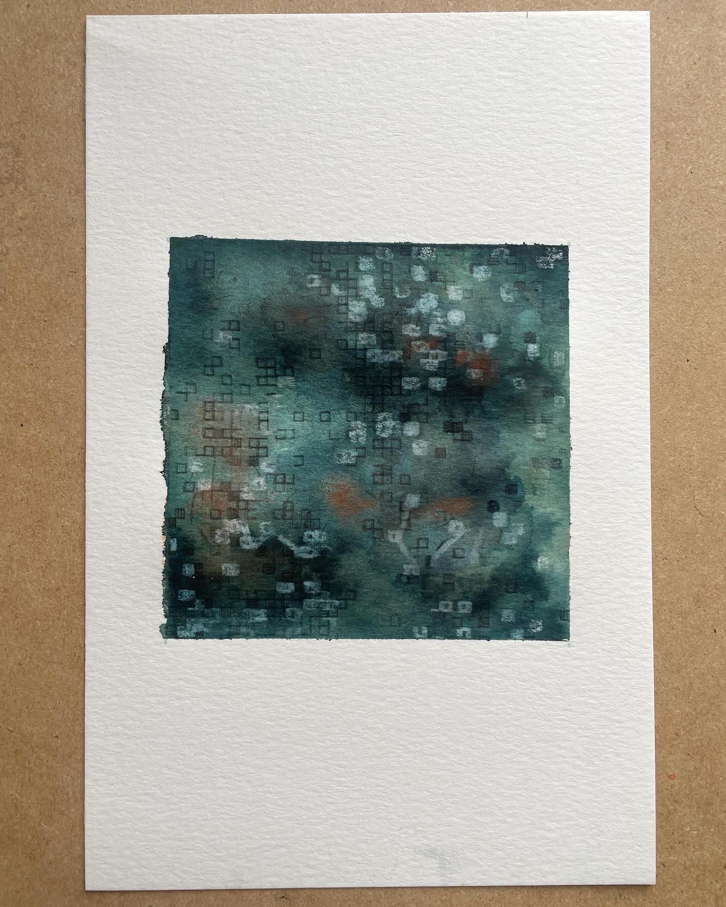
But I think there’s also think there is also an aspect that I find interesting and personally meaningful in terms of how the process invites interactive presence and attention vis a vis the visual results that are emerging. The different variables available here – how much water, how much ink/pigment, how dry etc. – can have big impacts on the visual outcomes that are emerging in the piece. As I move to using more layers, I find the back and forth between my interventions and the automated interventions of the machine to be quite interesting. I try to create the environment for the machine’s next intervention to be something fruitful, to take the piece in visually-effective dimension, based on my understanding and attention to the piece so far, and the past experiments with this process. I add some ink or some water. But then the machine comes again and does some things that may or may not conform with my hopes and expectations. Perhaps the machine picks up a bit more ink than I expected in some phase of the plotting, and the marks become much darker. Perhaps a part of the paper dries quicker than expected and so winds up empty or faint. There’s a lot of uncertainty. And once the intervention is made, it is made, and I have to work with what is next. Of course there are ways to try to erase, or hide things I don’t like, but more fruitfully I think the feeling is one of reaction and adaptability: this went in a different direction than I expected, and here we are; what might it need next? How can I create the environment for the next intervention to be successful, given where we are?
I was thinking about how this is a lot like how I imagine parenting to be; or at least how I think I would approach it. You try to create an environment for your child to succeed, which necessarily involves some assumptions about what “success” means. But then your child intervenes with the way they are, which is both shaped by your decisions and things outside of you. Ideally, as a parent, you mindfully observe and react to these unanticipated interventions, working in collaboration to re-cultivate the environment and co-create some shared version of success.
Anyway, here is the result for today:
Parenting
Day 5 (Thursday)
Today I make some new experiments. I am feeling anxious this morning, and so perhaps some boldness is just what I need. With that, two changes I explore:
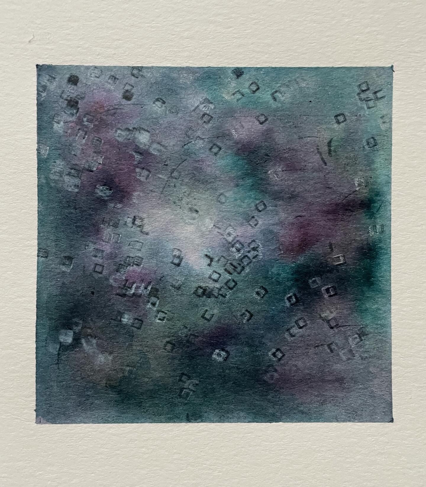
- I will test out the new ink I got – a super deep purple from Sailor. I tested it a bit offline yesterday and it flows a bit more than the black ink I have been using (from Lamy), so that should be interesting. I want to try
- I made some changes to the algorithm. In particular, I added some “rotation” to the square grid, which I expect creates a fair bit more movement in the composition and feel of the piece. I am curious how it will filter through the process.
In terms of paint, my intention is to create a bit more contrast than my previous iterations. I do like creating some coverage across the whole composition area; but also I want to explore a bit more contrast and less uniformity in the composition. There can be imbalance.
Here is the result:
…but not everything
I don’t love this result all that much, which is not suprising given all the new things that I was trying today. I do feel that I learned some new things. More detailed critical reactions:
- I don’t love the color palette that emerges from combining the blue/black ink and the purple ink, at least not by itself. It’s giving dark dixie cup. I will have to think about if there is a warmer color I can add perhaps to balance out this effect. Maybe a earthy burnt orange. Or maybe I should keep the two colors separate.
- In general, this still feels dark and muddy to me. I will need to think about how to approach mitigating this. Some warmer elements are helpful.
- In this variation of the process, I think that I am losing some of the charm of the original approach, that emerged from having ink in the pen which created beleding. I do still have some variation in tone and value, but the bleeding is less here. I guess this probably both about removing ink from the pen and about leaving the page somewhat less damp and saturated in ink for the pen to pick up. I think in my next iteration I do want to recover some of this, since I think that the interaction of the machine drawing and the ink/water is one of the more interesting features here.
- I don’t know if I love the rotation in the squares. I think it takes away from the contrast in the previous iterations between the rigid structure of the axis-aligned grid and the organic watercolor. Maybe there are ways I can retain more of that, but add bits more variation here and there in terms of alignment or rotation.
Some more positive / constructive observations:
- New masking tape from Blick worked well, and I finally got a clean edge all around which is great.
- I continue to enjoy the white pencil layering. I tried adding in a black watercolor pencil layer too which could be interesting to explore more. Watercolor pencils could be used in intermediate layers probably, and then blended/diluted with water on top.
- Something interesting I noticed in the process today is that in some of the early layers, the fountain pen left no visible marks on the page, but made grooves in the watercolor paper. When I later went back and added new layers of ink wash, the ink pooled in the grooves and revealed the shapes. I am wondering if that might point towards a whole different process to explore in the future. For future reference, the effect was with a fountain pen with only water (not flowing super well) and the 400 series Strathmore watercolor paper.
Day 6 (Friday)
Today, I’ve made some more tweaks to the algorithmic side. I guess that I am retaining some of the rotation, and also introducing more variation in the fills and sizes. We will see how this feels. In terms of color, I am going to return to ink in the pen, trying now with the new Sailor purple which I already have loaded. Here is the result:
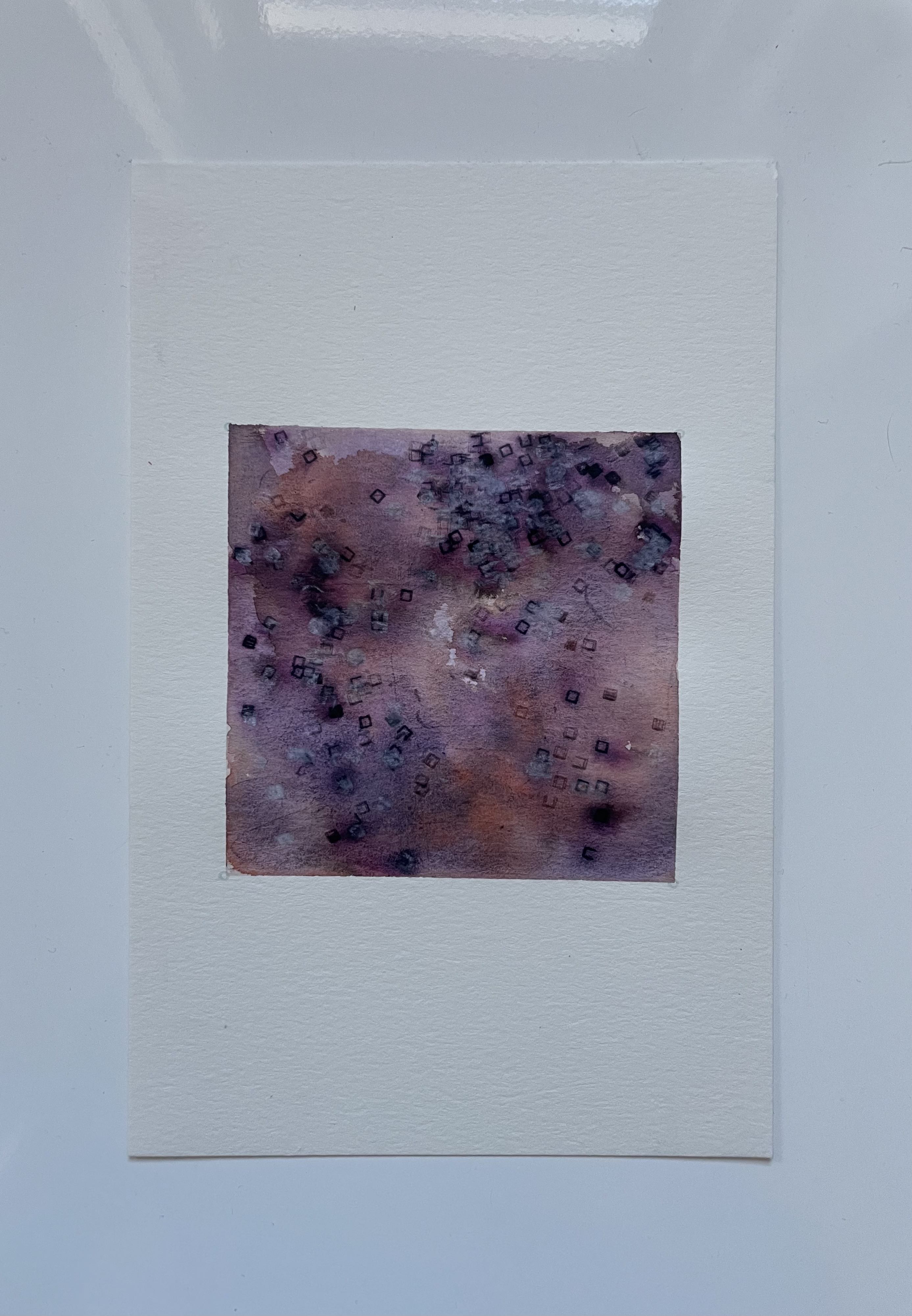
Inspection
In this variation, I put down a wash of the purple sailor ink first and plotted into it with ink while damp. I then added in subsequent layers with mixes of watercolor/ink and mostly the empty (water-filled) fountain pen. I finished with the white pencil as I’ve been doing.
Overall, I think this one is okay. I think the palette still doesn’t really speak to me here, though it was a good experiment. Maybe more blues will be helpful, and just a touch of the warmer tones. I am happy here in terms of getting more blending of the plotted layers with the watercolor and ink, from plotting ink into wet. However, there’s not as much contrast overall in the ink wash as in some previous tests. I am going to mull this over more today to see what direction to explore next.
I also tried documenting today with a video time lapse kind of thing. You can watch it here if you like.
Day 7 (Saturday)
Well I made it to day 7. Honestly feeling a bit uninspired today maybe. Maybe I ought to have slept a bit more or something. But in any case, here I am.
Here is the result:
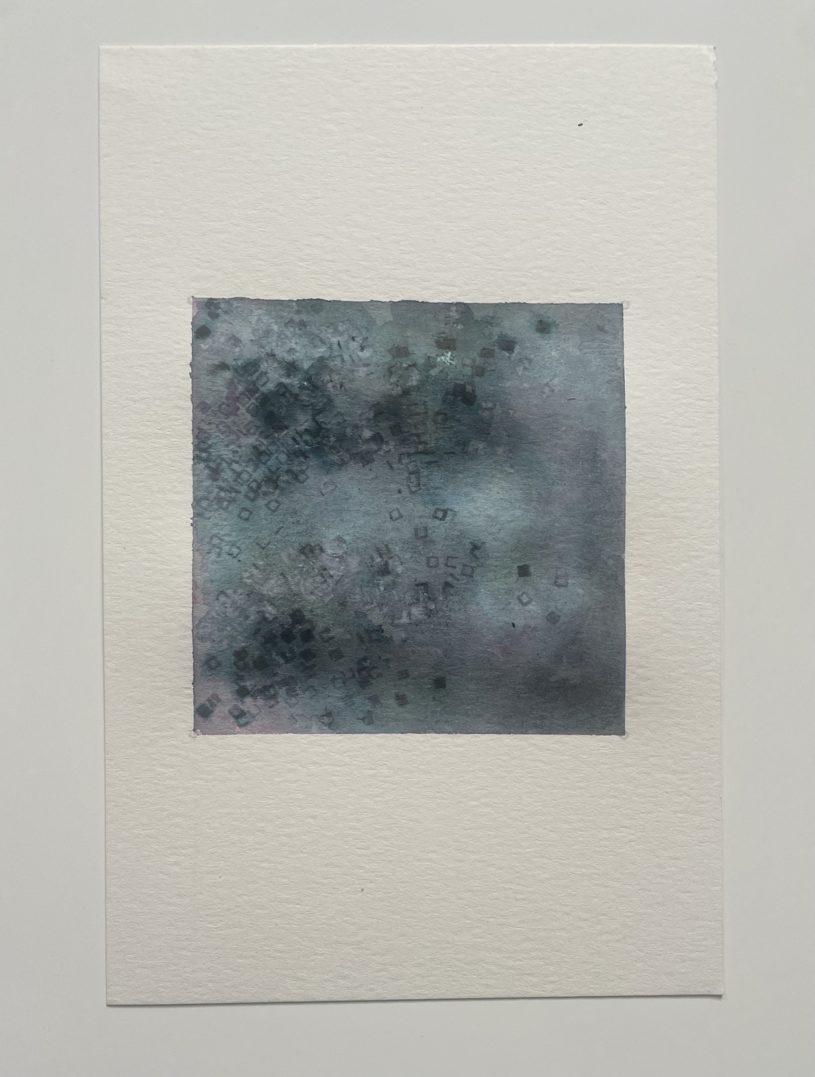
Participant observer
The interesting experiment/learning from today was that this was all done with the fountain pen without any real ink in the cartridge. This can create some nice effects just as it is (as I’ve explored previously); however, today I also explored dipping the pen for some layers either in ink, or diluted ink, or ink mixed with watercolor pigment. The pen picked up more ink than I anticipated when dipped even minimally. It also does pick up the watercolor pigment when that is mixed in.
In general, I think that this approach will be a great way to explore introducing more variation in value and color going in the plotted layers going forward, as I can create different mixtures on the palette directly and then dip the pen.
Here are some simpler studies on variations of this process to understand it better.
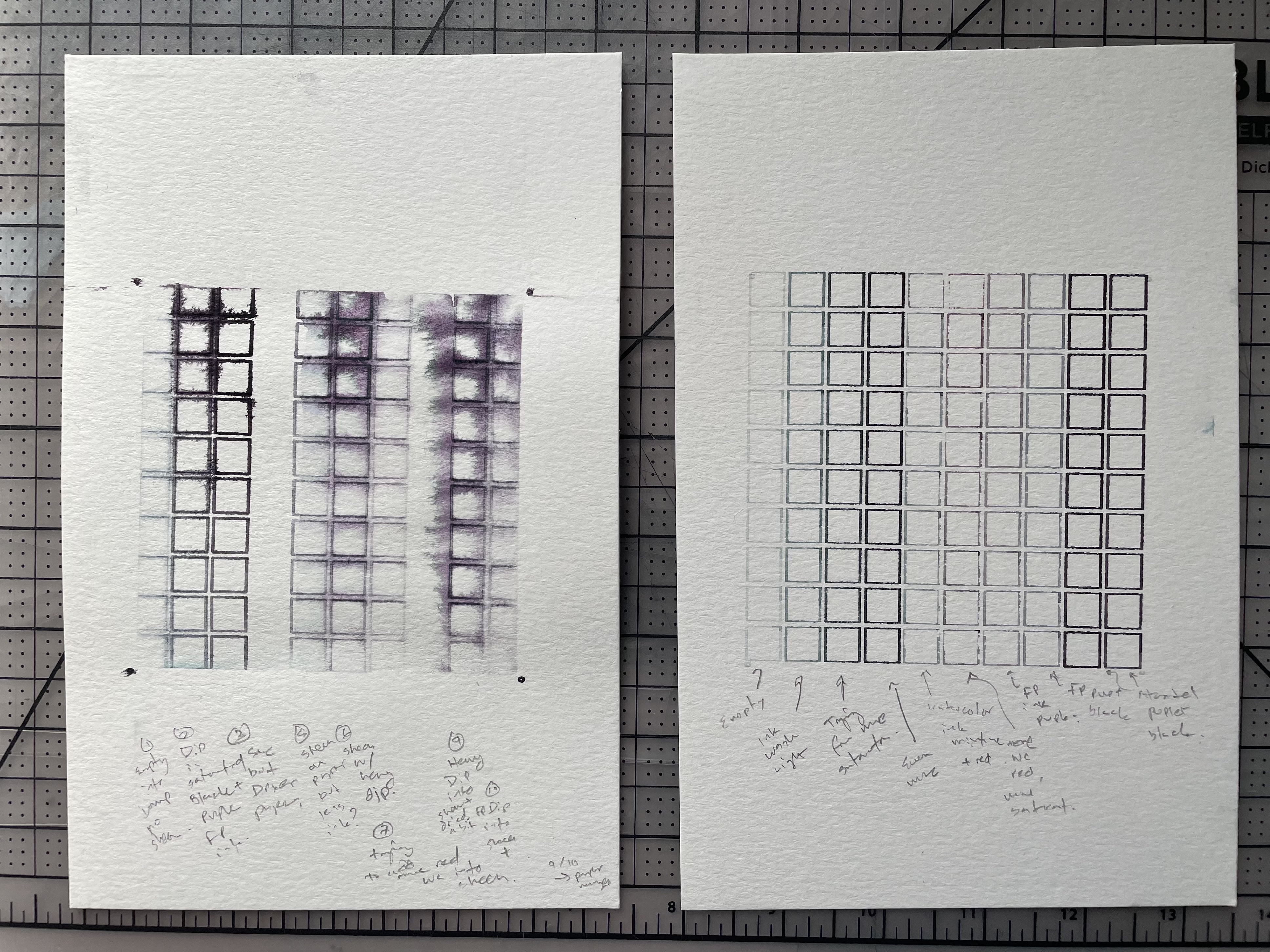
Foutain pen dipping study
This helped me build some intuition for variations in dipping and how they intersect with dampness of the paper. In general, there’s a lot of different effects possible here. One thing I noticed is that the watercolor pigment didn’t seem to pick up / flow as well as I thought. I may want to buy some fountain pen inks in more colors for mixing.