Adding Definition Tooltips in Qualtrics
I am currently working on a survey research project. As part of this project, we are asking survey participants for their beliefs about specific technologies and occupations. For example, throughout the survey, we ask participants for their beliefs about “chat-based LLMs”.
While the terms we are using to describe these technologies and occupations should be famililar to most participants, some participants might be unfamiliar. Further, participants who are familiar with terms could nonetheless have slightly varied understandings of what the terms mean. This adds noise to survey results, as participants are effectively answering slightly different questions.
The standard and obvious solution to this issue is to clearly define terms in the survey either within specific questions or at the outset. However, we are repeatedly asking about a few specific terms. As such, we’d either need to redundantly include the same definition a number of times, or else define terms at the outset and risk participants skimming or forgetting.
A slightly more elegant solution is to use something like an HTML tooltip throughout the survey which pops up the term definition on click or mouseover in case participants forget or need a reminder without adding excessive clutter or cognitive load to the survey experience.
In this post, I will document how to implement this kind of definition tooltip in Qualtrics.
Setting Up The Tooltips
The basic functionality I would like is the following.
- In a centralized location, I would like to be able to define a set of terms and definitions. The tooltip with the definition should appear anywhere that the corresponding term appears in a question in the survey.
- The tooltips should work on both web and mobile. On web they should activate on mouseover; on mobile they should activate on tap. They should be formatted in a legible way that is appropriate for screen size.
- I would like to have a way to manually exclude the tooltips in areas where they might not be appropriate.
I took this to ChatGPT to propose an implementation. Here is what it proposed:
Expand for Javscript Logic
// ---- CENTRALIZED GLOSSARY ----
// Edit this object to add/remove terms or change definitions.
// Keys are the terms to match; values are the tooltip text.
// Matching is case-insensitive and uses word boundaries.
const GLOSSARY = {
  "chat-based LLM": "Chat-based large language models (LLMs) are AI systems that understand and generate text through conversational interfaces. Examples include ChatGPT, Claude, and Gemini.",
  "chat-based LLMs": "Chat-based large language models (LLMs) are AI systems that understand and generate text through conversational interfaces. Examples include ChatGPT, Claude, and Gemini.",
  "Lawyer": "Lawyers, also called attorneys, advise and represent clients on legal proceedings or transactions.",
  "Lawyers": "Lawyers, also called attorneys, advise and represent clients on legal proceedings or transactions.",
  "Management Analyst": "Management analysts, often called management consultants, recommend ways to improve an organization's efficiency.",
  "Management Analysts": "Management analysts, often called management consultants, recommend ways to improve an organization's efficiency."
};

// ---- UTILITIES ----
function escapeRegex(s){ return s.replace(/[.*+?^${}()|[\]\\]/g, '\\$&'); }

// Turn runs of spaces in a term into a flexible whitespace matcher
function termToPattern(term) {
  // Escape regex metachars first, then replace literal spaces with a class
  const escaped = escapeRegex(term);
  // Match one or more of: normal space, NBSP, or any whitespace (includes \n, \t)
  return escaped.replace(/ +/g, '[\\s\\u00A0]+');
}

function buildRegex(){
  const terms = Object.keys(GLOSSARY);
  if (!terms.length) return null;
  terms.sort((a,b)=>b.length - a.length);

  // Optional: light suffix support (plural/possessive/hyphenated)
  const suffix = "(?:['’]s|s|-[\\p{L}\\p{N}]+)?";

  const pattern = terms.map(termToPattern).join("|");
  // Left/right “non-word-ish” boundaries in Unicode so we don’t match inside words
  return new RegExp("(?<![\\p{L}\\p{N}_])(" + pattern + ")" + suffix + "(?![\\p{L}\\p{N}_])", "giu");
}

function normalizeKey(s){
    return s.replace(/\s+/g, ' ').trim().toLowerCase();
}

const SKIP_TAGS = new Set([
  "SCRIPT","STYLE","NOSCRIPT","TEXTAREA","INPUT","SELECT","OPTION",
  "CODE","PRE","IFRAME","BUTTON","A"
]);

function wrapMatch(termRaw){
  // Find the canonical key (case-insensitive)

  const key = Object.keys(GLOSSARY).find(
    k => normalizeKey(k) === normalizeKey(termRaw)
  );

  const tipId = "tip-" + Math.random().toString(36).slice(2);
  const wrapper = document.createElement("span");
  wrapper.className = "glossary-tooltip";
  wrapper.setAttribute("tabindex","0");
  wrapper.setAttribute("aria-describedby", tipId);
  wrapper.appendChild(document.createTextNode(termRaw));

  const tip = document.createElement("span");
  tip.className = "glossary-tip";
  tip.setAttribute("role","tooltip");
  tip.id = tipId;
  tip.textContent = GLOSSARY[key];
  wrapper.appendChild(tip);

  return wrapper;
}

function replaceInTextNode(node, regex){
  if (node.nodeType !== Node.TEXT_NODE) return;
  const text = node.nodeValue;
  let match, lastIndex = 0;
  let replaced = false;

  const frag = document.createDocumentFragment();
  while ((match = regex.exec(text)) !== null){
    const before = text.slice(lastIndex, match.index);
    if (before) frag.appendChild(document.createTextNode(before));

    frag.appendChild(wrapMatch(match[0]));
    lastIndex = match.index + match[0].length;
    replaced = true;
  }
  if (!replaced) return;

  const after = text.slice(lastIndex);
  if (after) frag.appendChild(document.createTextNode(after));
  node.parentNode.replaceChild(frag, node);
}

function shouldSkip(node){
  if (!node.parentNode) return true;
  if (SKIP_TAGS.has(node.parentNode.nodeName)) return true;
  if (node.parentNode.closest(".glossary-tooltip")) return true; // don't rewrap
  if (node.parentNode.closest(".no-glossary")) return true;      // manual exclusion
  return node.nodeValue.trim() === "";
}

function processRoot(root, regex){
  const walker = document.createTreeWalker(root, NodeFilter.SHOW_TEXT, {
    acceptNode(node){
      return shouldSkip(node) ? NodeFilter.FILTER_REJECT : NodeFilter.FILTER_ACCEPT;
    }
  });
  let n;
  while ((n = walker.nextNode())) replaceInTextNode(n, regex);
}

function processPage(){
  const regex = buildRegex();
  if (!regex) return;

  // Qualtrics question container is usually #Questions, but we fall back to body
  const container = document.querySelector("#Questions") || document.body;
  processRoot(container, regex);
}

// ---- QUALTRICS HOOKS ----
if (window.Qualtrics && Qualtrics.SurveyEngine) {
  Qualtrics.SurveyEngine.addOnload?.(function(){ processPage(); });
  Qualtrics.SurveyEngine.addOnReady?.(function(){ processPage(); });
} else {
  document.addEventListener("DOMContentLoaded", processPage);
}

  // ---- OBSERVER ----
  const target = document.querySelector("#Questions") || document.body;
  const observer = new MutationObserver(() => {
    if (observer._queued) return;
    observer._queued = true;
    requestAnimationFrame(() => { observer._queued = false; processPage(); });
  });
  observer.observe(target, {
    childList: true,
    subtree: true,
    attributes: true,
    attributeFilter: ['class','style']
  });
For reference, this all gets added in “Look and Feel” > “General” > “Header” and wrapped in a <script> tag after converting to source view.
I think that overall this is fairly straightforward in concept. The basic idea is that we have our GLOSSARY object; whenever a page gets rendered (or re-rendered), we are going to walk through the DOM and find any spots where the tooltip terms appear and wrap them in a span with the correct metadata to get picked up by our CSS logic which implements that tooltip. There’s a set of SKIP_TAGS which are excluded from the logic.
We also added an option to manually exclude a segment of text from the tagging logic by giving wrapping it in a <div class="no-glossary">.
Here is the corresponding CSS:
Expand for the CSS logic
/* The trigger (the term itself) */
.glossary-tooltip {
  position: relative;
  color: var(--accent);
  text-decoration: underline dotted var(--accent-2);
  text-underline-offset: 3px;
  cursor: help;
  font-weight: 500;             /* lighter than bold */
}

/* Tooltip bubble */
.glossary-tip {
  position: absolute;
  top: calc(100% + 6px);
  left: 0;
  transform: none;

  background: var(--tip-bg);
  color: var(--tip-fg);
  padding: 0.45em 0.7em;
  border-radius: 6px;

  font-size: 0.95em;
  line-height: 1.35;
  white-space: normal;

  width: max-content;            /* size to content but allow wrapping */
  min-inline-size: 20ch;         /* reasonable minimum */
  max-inline-size: none;         /* JS will set maxWidth per container */

  box-shadow: 0 4px 12px var(--tip-shadow);
  z-index: 9999 !important;
  opacity: 0;
  visibility: hidden;
  transition: opacity .15s ease-in-out, visibility .15s ease-in-out;

  pointer-events: none;
  text-wrap: pretty;
}

/* Arrow */
.glossary-tip::after {
  content: "";
  position: absolute;
  top: -5px;
  left: 12px;
  border-width: 5px;
  border-style: solid;
  border-color: transparent transparent var(--tip-bg) transparent;
}

/* Alignment overrides */
.glossary-tooltip.align-end .glossary-tip { left: auto; right: 0; }
.glossary-tooltip.align-end .glossary-tip::after { left: auto; right: 12px; }

.glossary-tooltip.align-center .glossary-tip {
  left: 50%; right: auto; transform: translateX(-50%);
}
.glossary-tooltip.align-center .glossary-tip::after {
  left: 50%; transform: translateX(-50%);
}

/* Show on hover/focus */
.glossary-tooltip:hover .glossary-tip,
.glossary-tooltip:focus .glossary-tip,
.glossary-tooltip:focus-within .glossary-tip {
  opacity: 1;
  visibility: visible;
}

/* Focus ring */
.glossary-tooltip:focus {
  outline: 1.5px solid var(--accent-2);
  outline-offset: 2px;
}

/* Motion preference */
@media (prefers-reduced-motion: reduce) {
  .glossary-tip { transition: none; }
}

/* Allow tooltips to escape question containers */
.QuestionOuter,
.Inner,
.InnerInner,
.QuestionText,
.QuestionBody {
  overflow: visible !important;
}
This is mostly styling fluff. The main logic is near the bottom, where we define some selectors that set conditions where the tooltips should appear.
After some issues with the tooltips running off the side of the screen, we added one more script to the header to fix up the display logic:
Expand for the Javascript logic
// Margin from container edges to keep the bubble inside visible question area
const TIP_MARGIN = 32;

// Find the nearest Qualtrics question container to constrain within
function getQuestionContainer(element){
  return (
    element.closest('.QuestionBody, .QuestionText, .InnerInner, .Inner, .QuestionOuter, #Questions') ||
    document.querySelector('#Questions') ||
    document.body
  );
}

function adjustTooltipPosition(wrapper){
  const tip = wrapper.querySelector('.glossary-tip');
  if (!tip) return;

  // Make sure it has layout before measuring
  const prevVis = tip.style.visibility, prevOp = tip.style.opacity;
  tip.style.visibility = 'hidden'; tip.style.opacity = '0';
  // Temporarily force it to render where it would be
  const prevDisp = tip.style.display;
  tip.style.display = 'block';

  // Reset any previous alignment
  wrapper.classList.remove('align-end','align-center');

  // Reset inline offsets from any prior runs
  tip.style.marginLeft = '0px';
  tip.style.left = '0';
  tip.style.right = '';
  tip.style.transform = 'none';

  // Measure
  const container = getQuestionContainer(wrapper);
  const cRect = container.getBoundingClientRect();

  // Ensure the tooltip cannot exceed container width
  const maxAllowed = Math.max(160, cRect.width - (TIP_MARGIN * 2));
  const prevMaxW = tip.style.maxWidth;
  const prevMinW = tip.style.minWidth;
  tip.style.maxWidth = maxAllowed + 'px';
  tip.style.minWidth = 'auto';

  const rect = tip.getBoundingClientRect();

  // Compute overflows
  const leftLimit  = cRect.left + TIP_MARGIN;
  const rightLimit = cRect.right - TIP_MARGIN;

  let shiftX = 0;
  if (rect.left < leftLimit) {
    shiftX += (leftLimit - rect.left);
  }
  if (rect.right > rightLimit) {
    shiftX -= (rect.right - rightLimit);
  }

  // Apply horizontal shift relative to the default left:0 anchor
  if (shiftX !== 0) {
    tip.style.marginLeft = Math.round(shiftX) + 'px';
  }

  // Restore styles
  tip.style.display = prevDisp;
  tip.style.visibility = prevVis;
  tip.style.opacity = prevOp;
  // Keep computed maxWidth/minWidth but restore author inline styles if any
  // (We assume our maxWidth is desired; if not, comment out the next two lines)
  // tip.style.maxWidth = prevMaxW;
  // tip.style.minWidth = prevMinW;
}

// Reposition when a tooltip is about to show
document.addEventListener('mouseenter', (e) => {
  const w = e.target.closest('.glossary-tooltip');
  if (w) adjustTooltipPosition(w);
}, true);

document.addEventListener('focusin', (e) => {
  const w = e.target.closest('.glossary-tooltip');
  if (w) adjustTooltipPosition(w);
}, true);

// Keep it sane on rotate/resize
window.addEventListener('resize', () => {
  document.querySelectorAll('.glossary-tooltip').forEach(adjustTooltipPosition);
});
In the end, here is what the tooltips look like:
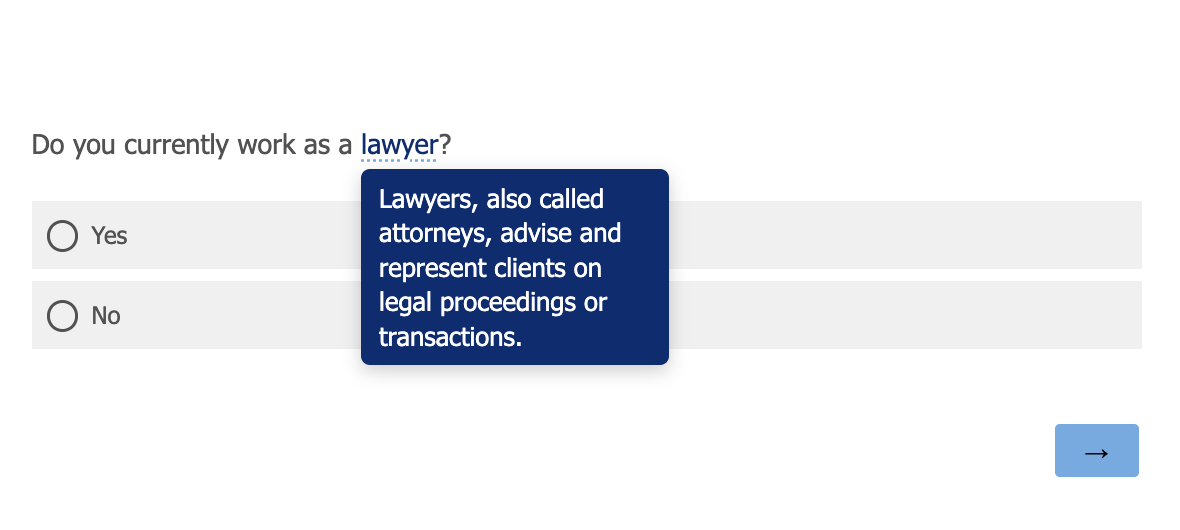
It shows up on mouseover, and seems to work reasonably on both web and mobile (on mobile you tap to see it).
Was this worth the effort to implement? Almost certainly not in retrospect, but c’est la vie. I thought it would be a bit easier to get working well than it turned out to be. But at least it is done now.
As a final refresh, what do I need ot do to add this to a new survey (for my own personal reminders):
- Add the two javscript scripts in the Qualtrics header, wrapped in
<script>tags. - Add the CSS logic in the Look and Feel > Style > Custom CSS section.
- Wrap any text where I don’t want the tooltips in a
<div class="no-glossary">. - Definitions can be added/modified in the
GLOSSARYobject of the first js script.